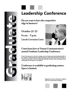
- Description: Flier Project
- Process (Programs, Tools, Skills): I sketched out the four required concepts. I then brought those to a critique group and asked what they thought about the different designs. From there I chose one concept and put it together for the critique process assignment. I then took the feedback that I received at the critique and made changes to improve my design. Changes that I made based on the feedback concerned alignment of the photo, sizes of text, and logo selection.
- Message: I feel that the main message of the flier is to encourage participation in the leadership conference.
- Audience: The target audience are graduates that are interested in increasing leadership skills.
- Top Thing Learned: I learned that there are countless valid ways to represent the same idea. The most successful fliers depended on following the principles of design and had a unique focal point. I also learned more about gestalt and how having central message can improve the gestalt of a composition.
- Title Font Name & Category: Ebrima, Sans Serif
- Copy Font Name & Category:Adobe Caslon Pro, Serif
- Links to images used in this project: Logo and photo
- Comment
- Reblog
-
Subscribe
Subscribed
Already have a WordPress.com account? Log in now.

Roberta—great job on your flier! I really like how the word GRADUATE really stands out on the side of the design. I look forward to learning from you this semester.
LikeLiked by 1 person
Hi Roberta! I really like your flier! Some of my favorite parts are:
1. I love the Graduate title across the edge of the page. It is clean and eye catching. I like how you have both a two toned type and a gradient background. That really helps to accentuate who the audience is.
2. I love the three blocks at the top and bottom of the page, they add great repetition, both in having the same shape and the alternating colors. This helps to pull your eyes through the whole document and also ties in the logo you used.
3. Finally I like the overall feel of the flier. Your message is clear and I feel that it will be appealing to the audience. I also feel that the photo of the gentleman appears thoughtful, which should promote thoughtfulness in the reader as well.
http://wp.me/53vOj
LikeLiked by 1 person
Hi Roberta,
I liked the three boxes at the top and bottom of the flier in graduating colors. Good choice on using the darker color on the outside and fading inward to draw the eye back in towards the flier. Also, good decision on placing the image in a square frame to repeat the square element. You did a good job in establishing a hierarchy of the information by varying the font size and effects.
I recommend your review Monica’s flier: http://monicagardnerbyui.wordpress.com/2014/10/03/p1-flier-project/comment-page-1/#comment-4
You can view mine at: https://visualmediabyhonsvick.wordpress.com/
–Carolyn
LikeLiked by 1 person
Great “Graduate” banner; lot’s of creative appeal.
LikeLiked by 1 person